Like it or not, cliche as it is, we all judge books by their covers. An effective cover can convey a book’s tone; is it a lyrical meditation, a brash appraisal of contemporary life, a hard-boiled noir, or a fizzy modern romance? Book covers should give readers a sense of what they are in for (unlike these misleading ones). Successful book covers will look modern without looking like a trend that will mark it as out of date by next year. To ensure that your titles look fresh and inviting for 2019 readers, we’ve rounded up some of our favorite trends in book design.
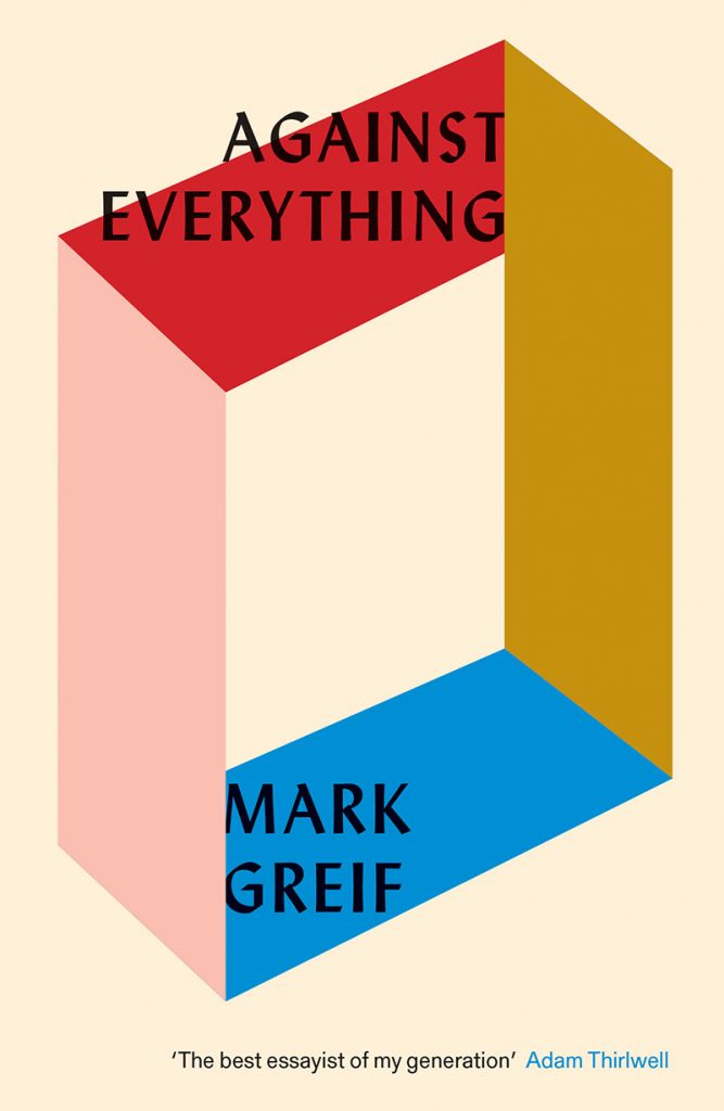
Lydian font
This font has been all over the publishing industry, gracing the covers of some of the buzziest books of recent years. Lydian dates back to 1938, giving it a well-earned timeless feel. Lydian has been successfully deployed in the service of essay collections, novels, non-fiction, and more.
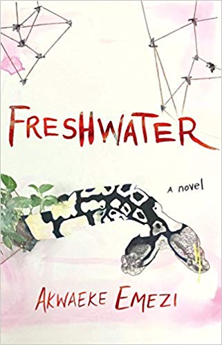
Hand-lettering
Hand-lettered covers give books an honest, lived-in feel. It connotes authenticity and vulnerability. It can also clue readers in to the emotional tone of a book while they browse. Sharp and angular scrawls can alert the reader to conflict, complication, and fracturing, as it does for Awaeke Emezi’s Freshwater and Mark Sarvas’sMemento Park. Hand-lettered titles can be intimate and authentic, which is especially important for nonfiction titles like I Can’t Date Jesus.

Vintage Nature Imagery
Using the visual iconography of an old encyclopedia or naturalist textbook gives a cover aesthetic gravitas. Covers like The Far Field look more established and timeless rather than trendy. Additionally, using vintage images of nature gestures to readers that the book will be about observation in some way. Lauren Groff’s Florida, with its vintage illustration of a panther, demonstrates to the reader that, like a naturalist observing animals, this collection of stories will feature close observation of creatures (human and otherwise) in their natural habitats.
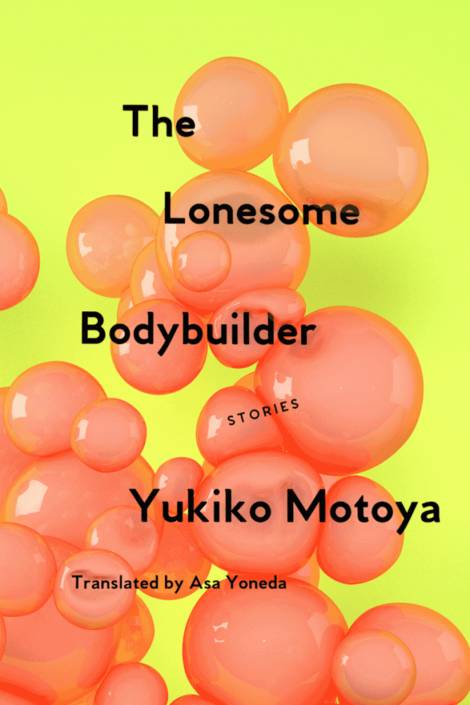
Gen-Z Yellow (and, of course, still millennial pink)
To give your titles a contemporary feel, and to hit a demographic of late teens to late-20s readers, consider the ubiquitous, but still popular, millennial pink. Or, for a fresher feel, it’s younger cousin, Gen-Z Yellow. Both are bright and inviting, and look great on a social media scroll. Consider this color palette, especially if your book is about millennial or Gen-Z characters. Better still, combine them both like The Lonesome Bodybuilder. Bonus points if you can take a queue from Soft Skull Press and animate your cover to give it some extra oomph.

Illustrated portraits and bright backgrounds
Tracing back to Where’d You Go Bernadette and further, covers featuring an illustrated figures against a bright background is a great way to attract attention for your titles and to visually place them in conversation with other breezy contemporary titles that have used the same style. Great examples of this trend include The Proposal, The Matchmaker’s List, and the Crazy Rich Asians series.
Be sure to check out some of our favorite covers on NetGalley in our Cover Love on the NetGalley homepage to gain even more inspiration!
