Romance covers have always worn their hearts on their sleeves — and sometimes very little else. But over the past decade, the visual language of romance books has gone through some major changes. One buzzy book in particular offers a perfect case study in how (and why) those trends have shifted: Heated Rivalry by Rachel Reid.
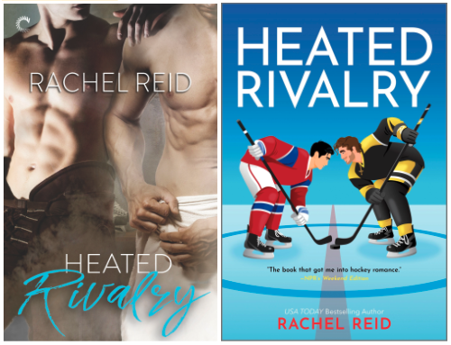
Originally published by Carina Press with a photo‑based cover featuring two shirtless hockey players, Heated Rivalry now sports a bright, illustrated, decidedly PG redesign. Same story. Very different vibes.
So what changed, and what does it tell us about the romance market today? Let’s lace up and take a look.
A Tale of Two Covers
The original cover, first published in 2019, leaned hard into heat: a photographic image of two muscular men, bare chests on display, locked in a pose that clearly signaled this book is sexy. For years, this approach was a mainstay of romance publishing, especially in subgenres like historical or paranormal romance. The at-a-glance information gleaned from a cover like this was effective and instantly legible on shelves, especially for dedicated fans of the genre. In fact, it was designed for dedicated fans of the genre — heaving bosoms and glistening abs signaled to romance readers exactly what they were going to get between those pages.
The new cover from 2024, by contrast, swaps realism for illustration. The characters are still hockey rivals. There’s still tension. But now…they’ve got clothes on! The style is more playful, closer to rom-com vibes than straight spice. Compared to the photo-realistic cover, this illustrated cover can appeal even to readers who might not consider themselves romance readers (or hockey fans).
Across NetGalley in particular, you’ll see illustrated romance covers consistently in our “Most Requested” carousels, both on the front page of the catalog and within the Romance category itself. They’re clearly here to stay, as our community continues to read, review, and share their love for this genre.
A cover change isn’t just cosmetic. It’s strategic.
But Why?
Illustration allows publishers to communicate romance without explicit sexual imagery, which has proven especially effective as romance readership has expanded and diversified, as reported by Shelf Awareness and BookNet Canada. Readers still want heat (arguably more than ever!), but these redesigned covers offer the chance to show off other elements readers enjoy such as humor, heart, and emotional payoff.
This kind of repositioning matters, even to the algorithms. Titles with refreshed metadata and packaging often see renewed attention from:
- Librarians reassessing collections
- Booksellers taking advantage of merchandising themes
- Readers discovering (or rediscovering) backlist gems
- Cross-over audiences, like TV-show watchers discovering source material
In other words: a cover change isn’t just cosmetic. It’s strategic. And, as our friends at Firebrand believe: this is the perfect time to update outdated descriptions with search-optimized copy, too! Good backlist metadata can protect future sales and can unlock major gains in visibility and revenue.
What This Means for Publishers
Yes, we’ll acknowledge that the cutesier covers have made romance more algorithm‑friendly. Covers that feel “safe to share” tend to travel farther on social media and retailer recommendation feeds. That doesn’t necessarily mean the spicier covers are a thing of the past though – on NetGalley, we see these more often tagged in the “Erotica” and/or “New Adult” categories, rather than just straight Romance.
But a thoughtful redesign is more than just gaming algorithms, it’s about staying relevant as reader tastes evolve. Reaching a new audience the second time around is good for everyone (but especially the readers!).
Curious how NetGalley can help you refresh your backlist? See our guide here!